
HOW WE CAN SERVE YOU
Tekniseri works as a partner for industrial manufacturers in production and development of industrial labelling and insulation products. We work as a one-stop-shop for our industrial customers and offer the whole portfolio of printed and insulation products, serving customers both in Europe and Asia. We work with major players in several industrial segments, however no industrial company is too small to be supported by our Tekniseri team.

Printed graphics
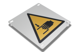
Printed metal plates
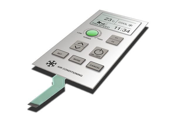
Printed electronics
Industrial insulation

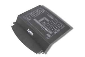
Printed metallic sub-assemblies
WHY CHOOSE OUR SERVICES?
The experience of Tekniseri in a wide variety of different industries, for example from industrial automation to medical equipment allows us to help customers with any needs they may come across in their operations.
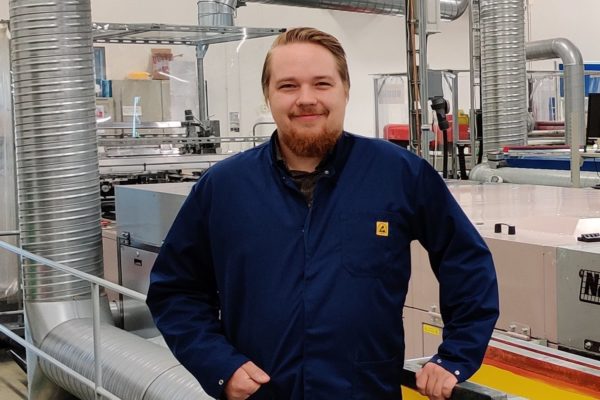
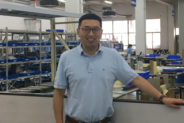
Our Production Units
See what the managers of our facilities have to say about Tekniseri


Thanks to the investments made, we have new production methods at our disposal for efficient service to our customers and cooperation with other units of Tekniseri!"
